
Effective retail signage captures consumer attention, draws in customers, and ultimately drives sales. To achieve that success, brands and retailers must incorporate a set of key signage principles that are deeply rooted in the unconscious mind.
The unconscious mind manages automatic processes, biases, and heuristics that shape perceptions and behaviors, creating cognitive shortcuts and facilitating more efficient decision-making and problem-solving. This applies to both complex problem-solving tasks and simple everyday choices, like interpreting retail signage.
Our Insider’s Guide to Signage Principles details 9 key principles of effective retail signage and, in this post, we’ll explore three of those principles in more detail with current examples captured in-store.
Keep Signage Simple
Perhaps Mark Twain said it best, “I didn’t have time to write a short letter, so I wrote a long one instead.” Taking the time to trim marketing copy and imagery down to the precise key message serves many advantages.
Simple signs are clear, readable, and convey information about product features, prices, promotions, locations, or other important details. They are noticed and understood, they increase findability, and they reduce the chance of confusion or misinterpretation.
Simple signs are especially helpful for people who may have visual or cognitive disabilities, lower literacy, or aren’t reading in their first language.
With a single glance at the sign, shoppers can grasp the message and behave accordingly. In the end, this leads to a more positive shopping experience.
These examples captured in-store showcase the benefits of simplicity. Each of them incorporate just a few key words and a single captivating image.
Shoppers seeking a new credit card, a Google Nest device, or fresh, prepared meals can immediately identify those areas without having to pause and read longer phrases.
By creating minimal distractions, simple signs like these help to direct foot traffic, optimize the flow of customers throughout the store, and increase customer satisfaction.

Follow the Signage Rule of Three
The Rule of Three builds on the first key principle of simplicity we just discussed. Effective signs keep their messaging concise and memorable by limiting them to no more than three key points or elements.
By following this principle, the volume of information doesn’t overwhelm shoppers and it makes sure that the most important information stands out clearly.
The Rule of Three also helps to improve readability and comprehension. Shoppers can quickly grasp the main message without having to decipher lengthy or complex content. Brevity and simplicity are always appreciated by busy shoppers who don’t have the time to stop and try to figure out or remember many components of a sign.
Finally, employing the Rule of Three increases the visual appeal of signage. Organizing information into three distinct sections creates a clean and uncluttered design that is visually pleasing and easy to scan.
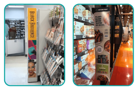
In these examples pulled from the shelves today, the Rule of Three is clear. Each has three sections. One section contains large, bold text describing the key objective of the sign. For those who wish to read it, the second section contains text with more details. Finally, the third section contains a key image, one of which incorporates a face, one of the most effective types of imagery.

Position Signage from Eye-To-Thigh
At some point, we’ve all been told to “Watch where you’re going.“
Our ingrained instincts are to protect ourselves from harm’s way by monitoring the environment directly in front of us. Not high above nor far below. As such, signs placed in the region from Eye-To-Thigh have an advantage.
By placing signs from Eye-To-Thigh, retailers can capitalize on shoppers’ natural tendency to focus on things within their immediate field of vision. This increases noticeability, engagement, and interaction with the sign.
Having signs in the natural line of sight for most adults optimizes reading without straining or bending. As such, it increases the ability of the sign to communicate important details such as prices, expiry dates, and product details.
These two examples captured in-store illustrate the Eye-To-Thigh principle well. Shoppers passing these signs will notice the text at eye level, and the accompanying images just underneath create a visually appealing finale to the sign.
Summary
Following these signage principles of simplicity, the Rule of Three, and Eye-To-Thigh will help you create retail signs that are visually pleasing, improve customer satisfaction, and effectively drive sales.
As experts in shopper marketing, the Explorer Research team has extensive experience creating effective signage, including helping a leading global spirits producer create a playbook outlining educational materials at the shelf, and helping the Ontario Lottery and Gaming Association optimize their in-store communication.
Download our Insider’s Guide to Signage Principles to uncover all 9 key principles and more!