
One area of in-store communication planning is overlooked more than any other. Not the message, nor the choice of media, but the placement of the communication message. An effective in-store sign should capture a shopper’s interest enough to be noticed; just like a great email subject line gets someone to open it, a great headline in a newspaper gets someone to read it or a great magazine cover makes someone buy it. When you consider the high cost of designing and printing signage, it’s important to create signage that does its job effectively. There are many factors that should be taken into consideration when deciding where to place signs in-store. While much of the following may seem like common sense, you’d be surprised how often these principles are overlooked.
 Key facts:
- Percentage of store signs viewed: 15% – 20%
- Average viewing time: less than 2 seconds
- Area where signs viewed the most: perimeter and power alleys
- Area where signs viewed the least: in aisle, at shelf
Many signs are too complex and are difficult to understand, others lack familiarity due to lack of brand recognition and some are simply not engaging. Shoppers use cues when scanning a store at a subconscious level that include color, shape, size, icons and faces (see the shopper brain below). This means that designers must think about familiarity, engagement, ease of viewing and placement.
The Shopper Brain
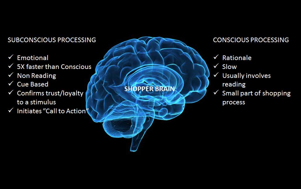
Wherever possible, familiar icons, imagery and shapes should be used to drive stand out. Curved shapes attract attention more than regular shapes. Unique or dynamic imagery also drives stand out. Images are much more effective for engagement because the human brain processes images five times faster than written messages. Images of human faces are one of the most effective ways to drive engagement.
A good rule of thumb when placing signage is the 20-10-5 foot test. From 20 feet, a sign needs to be seen and create stand out at the subconscious level. From 10 feet the customer needs to be able to identify the product within 1.5 seconds and at 5 feet the offer needs to be clearly communicated to affirm purchase selection.
One of the major keys to shopper engagement is signage placement. Signs should be aligned to core traffic zones where they can be seen. Here are some suggestions for signage placement:
- Corner placements (entry/egress)
- Allow ease of viewing (simple sightlines, areas of minimal clutter)
- Signs should be placed high enough to match average viewing angles (45 degrees up or down from eye level to a distance of about five feet)
- Signs need to be scaled to their environment
- Signage needs to be tailored to shopper behavior (the greater the speed of approach, the shorter the message)
Signage placement and messaging need to align. Signage fills different needs in different areas of the store and messaging should be tailored to the environment. Understanding shopper behavior helps determine the types of signage that should be placed in different zones. Where will the message resonate with your target shoppers? Are they information seeking, navigating, exploring and open to ideas? By understanding the shopper needs throughout the store journey and knowing where they are most open to communication, signage placement can be optimized and viewing improved.