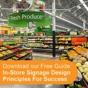
Most in-store signage is not read or noticed by shoppers. Our research shows that typically between 15-20% of signs are noticed. So how do we explain this from a behavioral standpoint? The main reason is that shoppers often have a task based mindset and there is typically cognitive overload in the retail environment. Shoppers are not reading while they are shopping and on a typical shopping trip less than 20 words are read. Complex signage should be avoided as it delivers low engagement. When we test complex signage, we typically see the highest levels of avoidance behavior. Complex messaging is best left to packages where customers “trust” brands and are more receptive to product information and comparisons.
 Signage can be important for branding, information, navigation, inspiration, overall store ambiance or promotion. However, routinely we see signs in-store that can be optimized. At Explorer, we have 8 signage design principles that our clients use to increase the amount of signage that is viewed. By following our simple rules, your in-store signage can work harder for you.
#1 Keep it Simple:
Simple design including copy and impactful imagery drives stand out and engagement. Communicate the message concisely in as few words as possible to your target audience. Crowding your sign with too many words or text makes it harder to read from a distance.
When deciding how to layout elements on a sign consider the Explorer Rule of 3. Eye tracking studies have shown that simple signs create easy navigation and engagement.
#2 Consistently use Color to Breakthrough:
The color of a sign must contrast its environment for effective stand out. Also from a retailer standpoint, consistently using one color scheme will create visual clout. Through repeating a similar aesthetic throughout a shopping trip you increase the likelihood of breaking through.
#3 Scale the Size of the sign to the environment:
A perimeter sign will require a larger size to maximize standout and an in-aisle sign should be visible from 20 feet. Often, we will see signage that is not scaled to the environment. By starting with the end in mind, you can increase the probability of being noticed just by scaling to the environment.
#4 Unique Shapes generate visual interest:
Our eyes naturally gravitate to unique shapes. Curved edges naturally attract our attention. By using a unique shape you can develop signs that will contrast with their environment and improve the likelihood of being viewed by shoppers.
#5 Locate Branding near the visual to create stronger brand linkage:
Branding should generally be placed near the visual to create high brand linkage.
#6 Keep Headlines short:
Ideally 3 to 5 words maximum. Use clean, crisp, easy-to-read type styles for maximum legibility and try not to overuse capital letters. Upper and lower case text is more legible from a distance than upper case letters alone. Finally, never use more than two fonts in a single design and ensure these fonts complement one another and can be viewed easily from a distance. As a general rule, thirty to forty percent of a sign’s area should be left as white space for optimal readability
#7 Use Engaging Visuals:
Visuals should be the dominant element of a sign as they more easily appeal to the subconscious (emotional brain). Evocative images are typically more powerful than functional images.
#8 Ensure the right balance between the Headline and Visual:
The headline and visuals should be balanced (in terms of size) to ensure meaningful engagement. This is where eye tracking can help fine-tune layouts by determining what is being noticed on your sign and what the scan pattern is.
If you want your signage to be a more powerful marketing tool, incorporate these tips into your design. Doing so will make your signs more compelling, and will ultimately result in increased sales.
