Do “New” flashes really work?
Not really. Typically “new” flashes are not a primary pack element that is viewed. Our research has shown that the average shopper typically only reviews 2-3 primary elements on a package. We call this the “Explorer Rule of 3”. So while it may be tempting to put a “new” flash on a package, it might not be viewed.
Explorer conducts packaging studies using the latest neuroscience technologies such as eye tracking and brain imaging. We typically find that the word “new” on packaging is not being seen by shoppers. There are two main reasons.
First, the word “new” is one of many words we as shoppers have “coded” as a symbol to allow us to process it quickly. Although the appeal of “new” is hard-wired into our brains, shoppers also don’t spend much time thinking about it. According to Daniel Kahneman we make thousands of decisions daily and the majority of these are through our System 1 thinking. If we thought about everything we do, there wouldn’t be enough hours in the day to process everything we need to. Words like “new” are processed subconsciously or when we are on auto pilot during our shopping routine.
Secondly, these symbols or cues need to stand out in order to be effective. I recently had a client ask if using a “new” flash on pack is worth it. My answer was that if it’s not a part of your primary communication the shopper won’t see it. Typically “new” flashes are located on the top corners of the front panel of the pack, where according to eye tracking, gets little viewing by most shoppers.
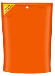
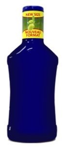
There are various ways the word “new” can be used on a package: in a bar, across a box, in a circle. Sometimes it’s just seen as a small cut-out on the front so it doesn’t affect the entire layout and design. Other times the word “new” takes up the entire top section of the box and is a completely different color resulting in a major change to the overall design.
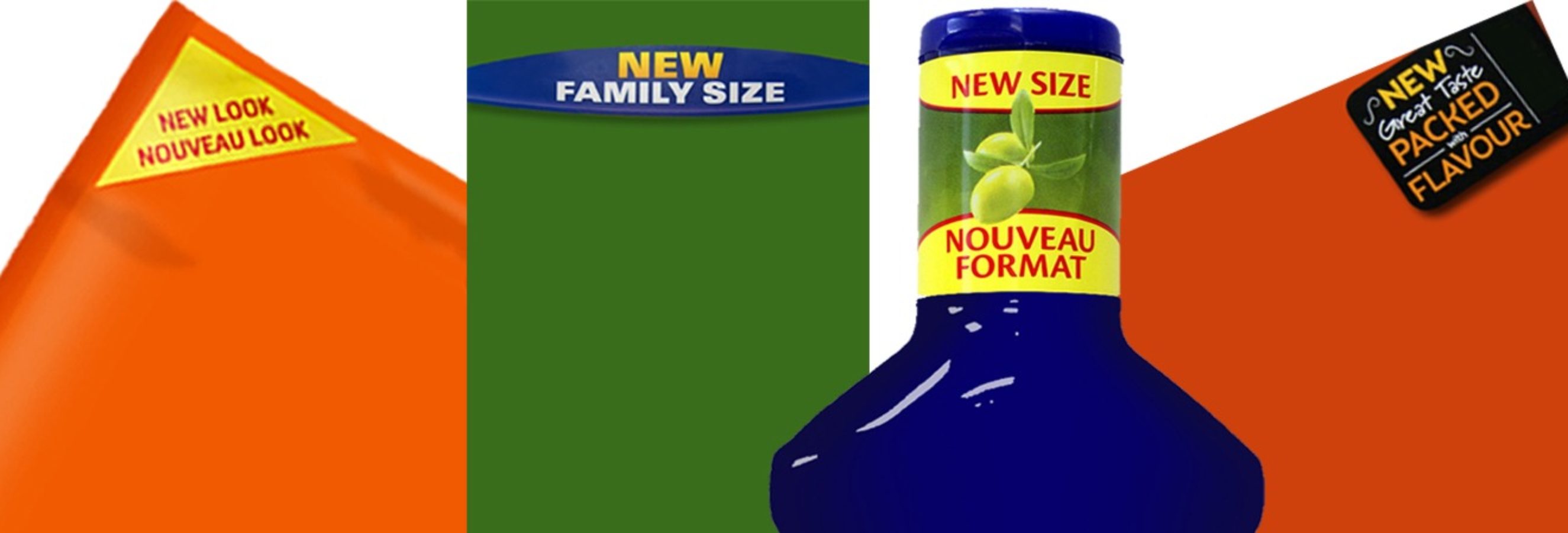
We tested a few different packages to see how well “new” flashes are viewed. What we found is that the “new” flashes were viewed between 19%-62% of the time. This would compare to brand viewing on packages which is in the 94%-100% viewing range. We tested a range of types of new flashes to be able to develop some learning around what makes “New Flashes” stand out.
Here are the results:
% Viewing of “New” Flashes on Packages

44%
 .
.
22% 19% 62%
Note: full package images were tested, we have removed all other package elements for this blog
These were our findings for standout of “new” flashes:
- Size matters- if you are going to put a “new” flash on your package, make it large
- Contrast- Use contrasting colors to improve standout- our eyes naturally gravitate towards contrast
- Keep it simple- single-minded focus helps with communication and reduces the cognitive load involved
We recommend that if you aren’t willing to “say it loud” on pack, then use POS, displays or other communication to break through. Here’s a good example:

Anne Stephenson
Chief Growth Officer, Explorer Research