Why packaging needs to be your most effective communication
In the average grocery store, there are 1.3 million written words on the front panels of packages. It would take the average person 16 days reading 24 hours per day to read every package!
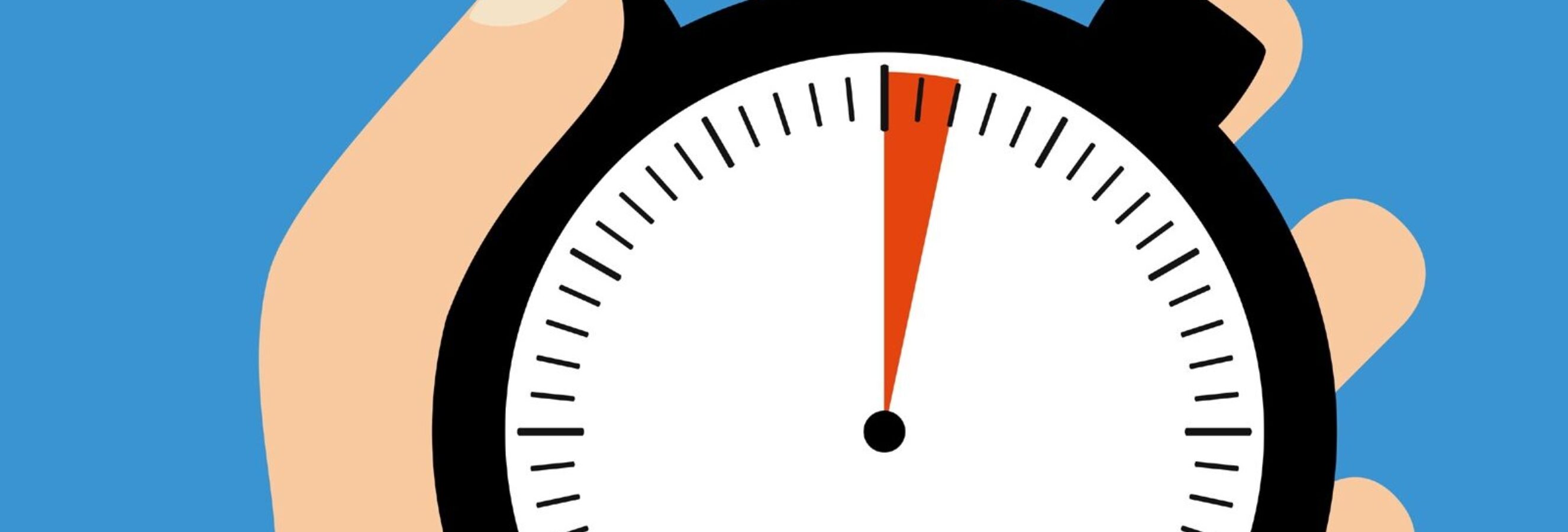
Quite often packaging is over designed with too many elements. When you compare packaging to different elements in your communication mix it has the fewest seconds to drive engagement.
A typical television ad has 15-30 seconds to capture attention. A print ad
has 3-5 seconds, however your packaging has less than 2 seconds to capture your shopper’s attention.
The need for packaging efficiency is driven by the buying brain. Much of our shopping behavior is driven by the subconscious side of the brain. Due to the large amount of stimuli (on average there are 45,000 SKUs in a grocery store), our brains revert to using shortcuts in order to process all of that information.
Much of what is processed about a package is color, shape, iconography and brand logos. Also image . . . emotionally engaging imagery works especially well. Think about dogs or cats on pet food packages or babies on diaper packaging.
At Explorer, we conduct packaging research with over fifty thousand shoppers each year and have found that many packages are over-engineered. On average there are 5-7 elements on a package and most shoppers can only process 3 elements on a package.
An Explorer packaging audit of all CPG products revealed that on average there are 28 words on the front panel of a package! On the average shopping trip, only 10 words are read and this includes signs in-store. So do the math, people aren’t reading your package! The one caveat I would make to this is certain categories where there is strong information seeking such as buying medication where you are reading to see what symptoms the product will address. Think about the last time you did that and how different it was from when you were picking up milk.
I am often asked about regulatory or mandatory elements on a package. The advice is to make them as recessive as possible and focus design on the primary elements. What it ultimately comes down to is making some tough choices around which design elements should be priorotized.
In our packaging research, we will typically eye track the front panel of packaging and breakdown which elements are viewed. We have norms around what percent of people are viewing the brand, sub brand, picture, size etc. on your package. Understanding how your package is visually processed can help prioritize what should stay or go.
Top 3 Tips to Ensure you Maximize your Two Seconds Worth:
- Challenge your team to decide on the top 3 elements on your package
Before you brief your design agency, have your team decide on the top 3 elements that you want to focus on for your package. Your design agency will love your single-mindedness. Believe me it will open up new creative avenues. Less really is more when it comes to packaging design. - Test your package on shelf
Start with the shelf context to understand how well your brand breaks through relative to the other products on the shelf. Getting noticed at shelf is often about contrast. - Reduce the amount of words and use iconography and images
Images are processed much faster than words so wherever possible use images versus detailed descriptions.
