
The Importance of Color in Packaging
When it comes to packaging, color is one of the most important components for attracting shoppers. Visible from a greater distance than other elements such as copy, illustrations or graphics, it’s often one of the first things people notice.
It plays a crucial role in getting your shopper to see what you want them to see, feel what you want them to feel, and to do what you want them to do. Understanding color psychology is so important for the success of your packaging. However, poor color choice can also negatively change the impact of your message. Get it wrong, and your great package design can be easily ignored.

The color of your package needs to stand out on shelf and should always be tested in context. It doesn’t exist by itself but among many different products. Research clearly shows that participants are able to recognize and recall an item far better when it sticks out from its surroundings. Choose a color that will elicit the most noticeability and engagement on the shelf. Consider if a unique color can be used that both suits the brand and is unusual in the category. Keep in mind that the amount of shelf space your brand has will influence whether or not your can create strong color blocks.
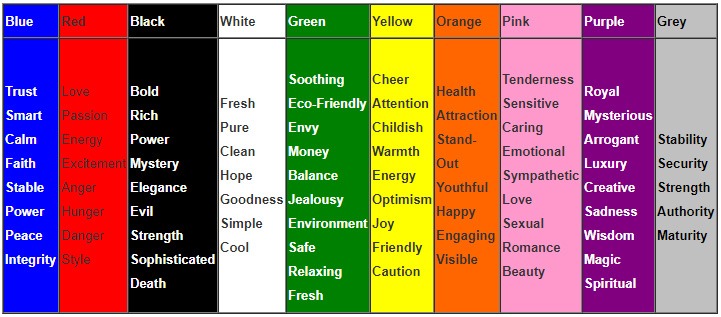
Because color has psychological implications, marketers have historically used certain colors to elicit different emotions (see chart below). The result is that sometimes entire categories have ended up with hard-to-differentiate packaging. When looking at a new product entry into a category, consider choosing an uncharacteristic color to stand apart from the norm within the category . Even if a flag ship color is a strong category identifier it can it be combined with another color to make a unique statement.
When choosing colors, here are a few principles to keep in mind:
- Keep it simple and try to only use 2 or 3 complimentary colors (colors that are opposite each other on the color wheel). People like simplicity and it makes your package easier to understand. There is an inherent danger in using too many colors as each color has meaning and adds or takes away from your message if used incorrectly.
- Try to use contrast to make elements on your package stand out. People often assume a difference in color is what makes contrast but that’s not true. You might have two colors that are completely different but have no contrast because their tone is the same. To test out your colors contrast, turn them into grayscale and review their contrast.
- Keep in mind your target market. Blue is liked universally by both genders while there is little agreement between men and women when it comes to purple. Men tend to prefer bold colors and shades (colors with black added), whereas women are more receptive to tints of colors (colors with white added). Also, be aware that cultural perception plays a strong role in color appropriateness which in turn can influence choices.
- Test different color options. You cannot know how your audience will respond to your package color until you test. Mock-ups should be tested and a full category analysis should be performed. At shelf shopper research and eye tracking can help optimize your package prior to launch.
Color is complex and there are no clear cut guidelines for choosing colors. The key is to look for practical ways to make decisions about color. Think about who your audience is and what message your product is trying to convey. Also make sure you test in context to ensure standout, contrast and engagement at shelf.