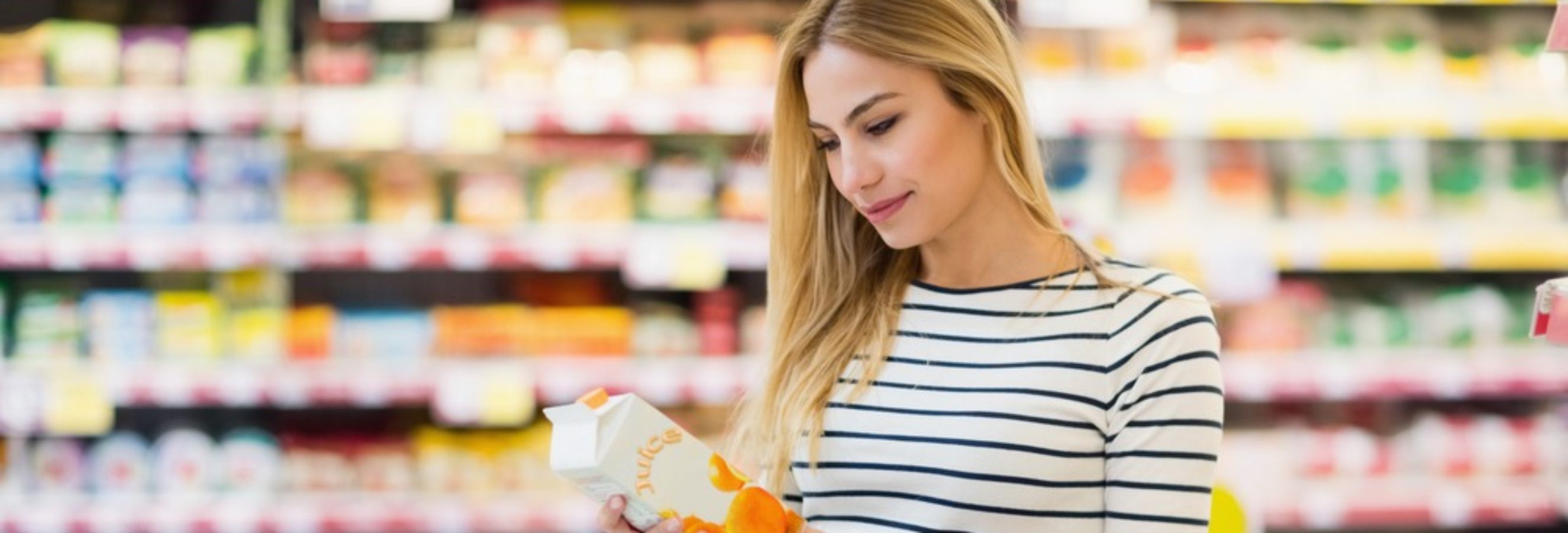
Product packaging is the first branded “moment of truth” when customers see a product in-store. Packages are also featured in most brand communications whether that’s TV, digital, or in print. It’s a key component of in-store decision making and is essential for breaking through the noise and differentiating a product. Packaging is even part of the usage experience. It’s no wonder that so much time and energy go into creating the perfect package.
Based on decades of research, a number of key principles have been discovered which help marketers create optimal packages.
Own a Color to Stand Out
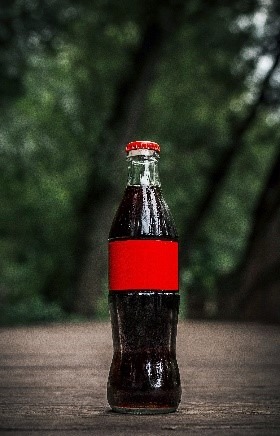 Color is one of the most effective features to own but you might choose to own a shape, size, icon, or face. These subconscious “codes” become visual cues that simplify shelf navigation for consumers. For example, if all of the branding was removed from a Coca-Cola bottle, most people would still recognize the brand by the bottle. (Test your brand color recognition here.) Similarly, if you saw a yellow M or a mermaid in a green circle, chances are you’d instantly recognize the brands as McDonald’s and Starbucks.
Remember the Rule of 3
The average package has 7 elements on the front. However, it takes 4.6 seconds to read those elements and packages are generally only viewed for 1.9 seconds.
In short, packages are often “over-engineered.” Eye Tracking research shows that the average person’s eye moves 3 or 4 times per second, and most shoppers engage with a package in-store for just 1 to 2 seconds. This means that package designers should try to identify just 3 elements which are essential for purchase decisions, and ensure they are in balance with the communication objectives. In the case of food and beverage, this usually includes 1) the product visual, 2) the brand or sub-brand, and 3) the flavor.
Use Visuals
 Packaging is allotted the fewest seconds to drive engagement. TV commercials get 15 to 30 seconds, digital and print ads get 3 to 5 seconds, but in-store packages get less than 2 seconds. Of all the available communication tools, packaging has no choice but to be the most efficient tool in the mix.
Key to this strategy is the use of visuals. Word processing is a slow, conscious process. It happens only as fast as you are reading this. However, image processing takes place subconsciously and it’s 30 to 50 times faster than reading words. As a result, “Show versus tell” is key when communicating ingredients or flavors. Visuals efficiently drive emotional appeal while simplifying and enhancing engagement. Words, even precise words, do not.
Reduce the Number of Words
If there are 20 words on the pack, take it down to 10. If there are 10, take it down to 5. Using fewer words retains engagement.
Incorporate a Shopper Mindset
Think about whether shoppers of your brand are more often in a state of Discovery, Impulse, Grab & Go, or Considered. Each shopper mindset comes with a different need state.
For example, shoppers with a Discovery mindset are seeking new products and have time to shop. They will be attracted by packages that attend to their emotional state. Shoppers in an Impulse mindset will be attracted by strong brand iconography. Know which mindsets are more in keeping with your consumers and design packages with them in mind.
Ensure Shelf Location is a Design Consideration
 We’ve already seen that shelf location has a significant impact on package viewability. Thus, if your pack is on a lower shelf with less optimal viewing, ensure the package stands out in color and/or shape. If your pack is next to a dominant brand, make sure it has high contrast with that brand. If you are displaying the dominant brand, focus on optimizing the brand block with a strong, ownable color key. Or, if your pack is shelved at the less than desirable start or end of the shelf set, optimize color and shape to improve viewing.
Ensure Packages Perform on the 20-10-5 Test
Lastly, check how your package will perform against the “20-10-5” Test.
- At 20 feet from a shelf, the color and shape of your pack must stand out to increase findability.
- At 10 feet from a shelf, branding must be clearly visible to start the engagement process.
- At 5 feet from a shelf, strong visuals are critical for driving engagement.
If you’d like to discover how to improve findability and engagement with your package, we’d love to hear from you. Contact us today.