Only 15% of in-store signs are viewed. And of those, the viewing time is a scant 2 seconds.
With statistics like that, it’s no surprise that brands and retailers must optimize every in-store sign in terms of both design and placement.
Like all other human experiences, people use both subconcscious and unconsious processes during the shopping experience. The conscious process, often call System 2, is rational and slow. When shoppers read signs, they’re using their conscious mind.
 On the other hand, the unconscious process, System 1, is automatic and fast. Rather than taking time to read words, it instantly reads cues related to colour, shape, size, and imagery. It’s emotional. It confirms our trust and loyalty to a stimulus and initiates a ”Call to Action,” whatever that action may be.
Through research conducted to understand the interplay between the conscious and subconscious shopper brain, we can offer a number of key principles that lead to in-store signs earning more attention and engagement.
Use Imagery. Because imagery uses the nonconscious brain, it is far quicker and more effective at driving engagement. Don’t simply use signs to write a description of how soft and shiny hair will be after using a shampoo. Show images of soft and shiny hair. Imagery can drastically increase engagement over words alone.
 Show Familiar Imagery. Broadly recognized icons help signs stand out. Simple illustrations of arrows, carts, keys, or elevators instantly tell shoppers where to get a key made or where to ride up to the second floor. And most of us will instantly recognize the brands we’re seeking when their well-known logos are featured.
Show Faces. One of the most fascinating hardwired tendencies people have is pareidolia – seeing faces in inanimate objects. Using faces in signage is a key way to take advantage of our innate ability and desire to pay attention to faces. As such, facial imagery is one of the most effective ways to drive engagement.
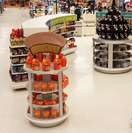
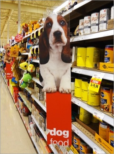
Create Unique Shapes. We’re so familiar with rectangle signs that hang from shop ceilings that we often don’t notice them. But when designers get creative with nonstandard shapes, signs can stand out and draw attention from shoppers. Try creating physically curved signs. Or, go full on 3-dimensional with giant versions of your product or package showcasing the shelf.
Avoid Complexity. A lot of visual cues are thrown at shoppers the moment they enter a store. In-store signs announce equipment, promotions, credit cards, policies, and more. Ensure shoppers don’t end up ignoring all the signs by paring signage down to the most important ones.
Complexity can also be reduced by ensuring each sign focuses on one key message. Let shoppers who want further information find it themselves on product packages.
Seek Simplicity. Drive attention and engagement to signs by using simple copy, simple designs, and impactful imagery. Eye-tracking research can easily help in this regard by helping you better understand where shoppers fixate on a sign, what their eye scanning patterns are, and what captures most of their gaze time.

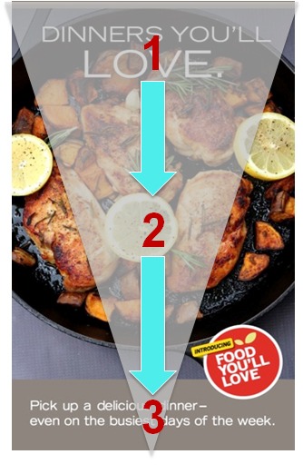
Create A Clear Visual Flow. Create a design flow that leads shoppers in one direction from the key message, to the visual, to the brand. Avoid designs that scatter attention in multiple directions leaving shoppers without a clear story.
Seek Key Placement. Once a sign has been well designed, it needs to be well placed. Signs should be aligned to core traffic zones where they can be seen. In general, signs are most effective near entry and exit doors. They should have simple sightlines and minimal clutter near them. Signs should also correspond with average viewing angles – from “eye-to-thigh.”
Let Digital Facilitate the Experience. Digital signs are typically highly noticeable because of the motion but generate low engagement. To compensate, digital signs are best used to showcase simple ideas such as sales, short-term specials, or product information.
When you’ve gone through all of these key principles, run a quick test of your sign. Make sure the sign is noticeable at 20 feet, the product is noticeable at 10 feet, and the offer is visible at 5 feet. With that confirmed, you’re ready to launch!
If you liked this article, you might also like these:
