The main focus of marketers tends to be verbal brand communication. Clever tag lines, producing advertising for print and digital media. Web sites and social media constantly demand new and relevant content. The messaging on packaging is also important. But if we stop and think about it, what’s really most memorable to consumers?
People are visual. Visual information is processed by the human brain in a tenth of a second, 60,000 timers faster than text is processed. Also, 93 percent of all human communication is nonverbal and 90 percent of the information that the brain takes in is through nonverbal methods. The human eye is host to 70 percent of all human sensory receptors and 50 percent of the brain is used to process images received by the eye.
 Another study that tested memory recall found that people could only remember 10% to 20% of the information they read after three days. When people digested the same information visually, the number jumped to nearly 65 percent. Strong visuals are more memorable than verbal communication. This is what allows packaging to sell right at the shelf, at the point of purchase. Other types of marketing aren’t as effective at doing this. Advertising may get people into the store and get them ready to buy but the actual decision to buy is made at the shelf. Like nothing else, packaging that has great visuals has the power to sell products and build brands. After all, most of us rarely buy a product based on advertising alone. Once we get to the store, it’s the packaging that must close the deal.
Since we process visual information so quickly, it’s the first touchpoint a customer has with your brand and the first thing that people use to establish trust with your brand. If they don’t connect with the visuals, you are losing their trust and most likely the sale. Also, the visual aspects of your brand need to be consistent with your customers. If they are not aligned, then you risk losing their interest and trust.
Across many categories there are all kinds of products that look the same and blend together on retail store shelves. Same color palettes, same visuals, same kind of package structures, and a similar look and feel. Packaging must use unique visuals to create an emotional response.
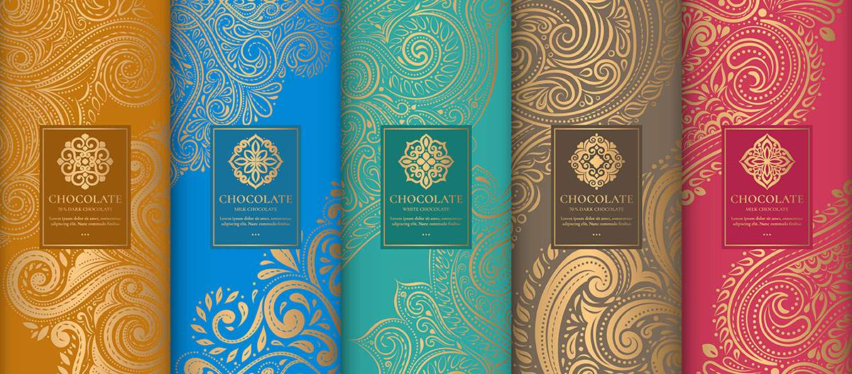
A unique communication hierarchy can be developed in packaging by leveraging visual design elements. Typography, imagery, a signature color, unique graphics and icons can all be used to communicate brand messaging at a glance. When these elements are combined a strong visual impact is created. Let’s look at a brand that is a leader in its category.

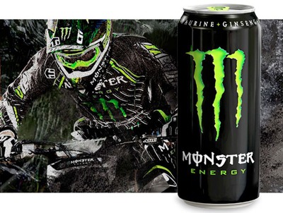
Monster Energy Drinks continues to dominate the energy beverage category. Why? Is it the tagline “Unleash the Beast” or the signature black packaging with the three long claw marks in neon green in the shape of the letter “M”? I think most of us would agree it’s the latter. Most consumers would be able to identify this brand if you removed the tagline and just left the visuals. What’s more, consumers around the world would be able to identify the brand, no matter what language they speak. Such is the power of great pack visuals. Packaging is one of the most tangible representations of brands. Breakthrough visuals can create category leaders by owning consumer mindshare and elevating brand status. Marketers would do well to consider focusing more of their resources on developing visual brand communication.
Visuals for packaging have also taken on greater importance due to increased time spent online. Today’s online consumers have short attention spans. In an age of soundbites and 10-second marketing videos we have become accustomed to instant gratification. Visuals are much quicker than text at communicating a message. We live in a visual, often non-verbal world where we’re used to clicking on icons (visual) when exploring concepts or following directions. Developing strong packaging visuals is in keeping with this trend.
Please contact us if you’d like to learn more about how strong visuals can improve your packaging.
