Shoppers are increasingly aware of the impact their purchasing decisions have on the environment. As shoppers continue to seek out environmentally friendly products and packaging, sustainability has become a critical issue to be solved.
Packaging design plays a critical role in consumer purchasing behavior; it is often the first point of contact a consumer has with a product, and it can heavily influence their decision to purchase it. As a result, it’s essential for companies to invest in packaging design that is visually appealing, clearly outlines the benefits and values to the consumer, and also effectively communicates the product’s sustainability efforts.
But how much of a sustainability callout on pack is needed? Will shoppers notice the claim? Is it relevant enough to sway their purchase decision? How will a sustainable packaging change impact the visual hierarchy of the existing pack?
To answer those questions, we turned to consumer research with eye-tracking to develop some packaging thought starters when implementing sustainability changes:
1. Cue sustainability with the packaging material
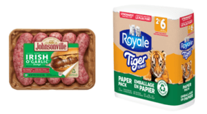
- Kraft paper, corrugated cardboard, and more natural dyes / less saturated colors help to signal the packaging is compostable or biodegradable. In tandem with an on-pack claim detailing this information, the packaging substrate can visually demonstrate sustainability and promote standout on shelf even before the shopper is close enough to read the claim on pack.

2. Leverage recognizable icons
- The human brain processes images 60,000 times faster than text. When shopping a shelf, recognizable icons and imagery can more efficiently catch the shoppers’ eye and be understood than a purely text-based claim.
- Everyone knows those three chasing arrows forming a triangle (♲) are the symbol for recycling; other symbols and icons such as a green leaf, the earth, or well-known third-party environmental certification (e.g., USDA Organic, Rainforest Alliance Certified) work to efficiently communicate to the shopper that this product offers something sustainable.
![]()
3. Balance sustainability elements to your communication objectives
- Package designs are typically “over-engineered” and often have too many design elements. The average shopper views a pack on the shelf for 1.9 seconds; but with an average of 7 elements on pack, shoppers would need to spend around 4.6 seconds to ensure all are noticed.
- When considering the depth of information, placement, and size of sustainability elements on the front of pack, ensure these elements are in balance to your communication objectives.
- For example, if you’re a coffee brand that sources their beans from fair trade farmers who grow the beans under natural, shaded canopies, using farming methods free from harmful chemicals and synthetic fertilizers, sustainability is likely a means of differentiating or driving a premium for your product. As a result, any on-pack sustainability elements should be visible in the first three visual fixations on pack.
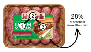
- Conversely, if you have a well-established brand that is founded on quality ingredients and great taste, sustainability may rightly have a more recessive role in the overall visual hierarchy, giving way to flavor imagery, descriptors, and brand. In this case, the sustainability elements would play a supplementary role in helping to sway the purchase decision. (see example pictured below)

4. Front of pack doesn’t have to do it all
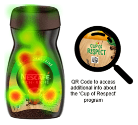
- Sustainability information can be dense and some shoppers seek very specific information to support the more visual claims. Balance the level of information required on pack to provide noticeability and credibility, but be cautious about cluttering the pack (front or back of pack) with too much detail. Where more information is required, consider a web page address or QR code on pack where info seekers can find out more.

While eye-tracking technology is a powerful tool for developing effective packaging design principles, it’s important to note that these principles may not apply universally across all products or target audiences. If you’re considering a pack change, there are many solutions that can help to inform and validate what claims to use, how to articulate them in consumer-friendly language, where they should be placed on the pack, and how to best optimize the pack to stand out at shelf.
Contact us today to find out more about sustainability claims and pack testing.