The Challenge:
A major retailer wanted to improve conversion rates on their website. They wanted to understand shopper expectations around their category of websites and how shoppers were interacting with their online presence.
What we did:
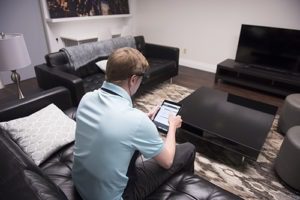
We conducted usability interviews in our digital lab where both PC and mobile platforms were tested. Respondents wore eye tracking glasses during the research and conducted navigation tasks followed by an in-depth interview.

The Result:
Identified opportunities to improve website navigation. A simplified architecture was recommended that reduced the amount of tile sizes, standardized image sizes and bundled offers more clearly. When the improved website was launched conversion rates went from 2% to 20% of users.
